The Economist's Toolbox: Numbers Please: Economic Data
Numbers Please: Economic Data
In the business press, you will read economic data. Often these data are called economic indicators because they indicate the level of activity or future activity in some area of the economy. I will explain economic data and indicators as they arise, but first I want to introduce you to some tools that economists use to organize and present data. These tools—various types of tables and charts—portray relationships between data more clearly. They help you understand the nature and degree of the economic activity that the data represent.
Reading Tables
Much of the economic data you will encounter will be presented in tables. To orient you to tables of economic data, we're going to work with actual GDP data. Table 3.1 shows annual Gross Domestic Product for the years 1990 to 2001 in two different ways and with two different growth rates.
| (1) Year | (2) GDP in Billions of Nominal Dollars | (3) Percent Change Based on Nominal Dollars | (4) GDP in Billions of Real Dollars* | (5) Percent Change Based on Real Dollars* |
|---|---|---|---|---|
| 1990 | 5,803 | 5.7 | 6,708 | 1.8 |
| 1991 | 5,986 | 3.2 | 6,676 | -0.5 |
| 1992 | 6,300 | 5.6 | 6,880 | 3.0 |
| 1993 | 6,642 | 5.1 | 7,063 | 2.7 |
| 1994 | 7,054 | 6.2 | 7,348 | 4.0 |
| 1995 | 7,401 | 4.9 | 7,544 | 2.7 |
| 1996 | 7,813 | 5.6 | 7,813 | 3.6 |
| 1997 | 8,318 | 6.5 | 8,160 | 4.4 |
| 1998 | 8,781 | 5.6 | 8,509 | 4.3 |
| 1999 | 9,274 | 5.6 | 8,859 | 4.1 |
| 2000 | 9,825 | 5.9 | 9,191 | 3.8 |
| 2001 | 10,082 | 2.6 | 9,215 | 0.3 |
EconoTip
When you look at a table, be sure to read the title of the table and all the headings for the columns and rows carefully. It's easy for many people to plunge into the numbers without really reading the words, but it's the words that tell you what numbers you are looking at.
*1996 dollars
Source: Bureau of Economic Analysis
Now, there are a lot of numbers here and some unfamiliar terms in the column headings, so let's take this piece by piece.
The title of the table indicates that it covers Gross Domestic Product for a twelve-year period from 1990 to 2001. (These are all actual values from the Bureau of Economic Analysis website, which I'll tell you about at the end of this section.) I've numbered the Columns 1 through 5 for easy reference as I walk you through the table. The column headings describe the data in the column.
Taking each column in its turn, Column 1 indicates the year for the data in that row. (So far, so good.) The other columns require a bit more explanation.
EconoTalk
Values expressed in nominal dollars, also known as current dollars, have not been adjusted for the effect of inflation. They are values reported in the dollars of each year being examined. Values expressed in real dollars, also known as inflation-adjusted dollars, are free of the effect of inflation. Economists use real dollars in many analyses because they want to understand economic activity without distortions introduced by inflation. For instance, if nominal incomes are rising, but real incomes are falling, consumers are actually worse off even though they are making “more money.”
Nominal vs. Real Dollars
Column 2 is GDP in billions of nominal dollars. These dollar values are expressed in billions, meaning that you should imagine that each dollar figure in the table is followed by nine (yes, nine) zeros. So GDP for 2001 is $10,082,000,000,000, or ten trillion, eighty-two billion dollars. Another way of writing this would be $10.082 trillion.
Nominal dollars, also known as current dollars, are dollar values that have not been adjusted for inflation. They are dollars counted the way everyone counted them in the year they correspond to, with the effect of inflation included. Again, we will learn about inflation, but you know that inflation causes money to lose its value. If the general rate of inflation is 3 percent a year, then the average item that cost $100 on January 1 of that year would cost $103 by December 31. The price is “inflated” because the dollar lost some of its value, that is, some of its purchasing power.
Economists want to be able to look at what's going on in the economy without the effect of inflation. They want to know that GDP or exports or incomes are really growing, not just being inflated by a dollar that is losing its value. So, to get rid of the effect of inflation, they convert current dollars into real dollars, which are also known as inflation-adjusted dollars. In Table 3.1 they do this by converting all of the values in Column 2 into the 1996 dollar values you see in Column 4. I won't bother you with the calculations economists use to do this, but they do it. Also, they could have pegged the real value to the value of the dollar in another year, for instance 1985. The key thing is to convert the value of GDP across all years to the value of the currency in one base year. That way, you are comparing year-to-year growth in real GDP, not nominal GDP.
To see the results of their calculations, let's jump over to Column 4. In Column 4, GDP is valued in billions of real dollars. As a result, we see that some of the value of our $10 trillion economy is indeed due to inflation. In fact, the real, inflation-adjusted value of the 2001 GDP in 1996 dollars is “only” $9.2 trillion.
So now when you hear a newscaster say, “Real GDP grew by 2.5 percent last year,” you'll know what it means. In fact, GDP growth rates reported in the business news usually are based on real, inflation-adjusted values.
The use of 1996 as the base year for converting nominal to real dollars creates an issue that will help you understand the nature of real dollars. You may have noticed that in the year 1996—and only in the year 1996—GDP has the same value in both nominal and real dollars: $7.813 trillion. Before the year 1996, the real dollar values for GDP are higher than the nominal dollar values. After 1996, the real dollar values are lower. That's because after 1996, the conversion from nominal to real dollars deflates the nominal GDP number. However, before 1996, the nominal values inflate GDP to the value of the dollar in 1996, which was higher. (This would not have occurred if real dollars valued in a base year before 1990 had been used.) Comparing the nominal and real values of GDP in any given year doesn't really do all that much for us.
What does this say about real dollars? It says that they are best used when comparing a value from one period to the next. Knowing that in 1991 GDP grew by 3.1 percent in nominal terms but fell by 0.5 percent in real terms tells me a lot. It tells me there was a recession going on—a fact that would escape me if all I had to work with were current dollars. But knowing that the value of GDP in 1991 was $5.986 trillion in 1991 dollars and $6.676 trillion in 1996 dollars doesn't do me much good at all.
Keep on Growing
EconoTip
Over the long term, meaning 20 years and longer, U.S. GDP grows at an average of about 3 percent in real terms. It's interesting that even in 1990 to 2001, a period characterized by tremendous advances in technology, healthy levels of consumer spending and business investment, relatively low inflation, and good management of the economy by the government, real GDP still grew at an average rate of about 2.85 percent.
One factor in this is that the U.S. economy is so large, even if newsworthy growth occurs in various areas, as it did in high technology or Las Vegas, there are still large, older, slower-growing industries and regions that offset that growth. Also, some of the growth in the 1990s was, in a way, not real, as we will see.
Columns 3 and 5 tell us about GDP growth. The point of using real, rather than nominal, dollars becomes really clear when you look at growth over the years. For instance, in 2001 nominal GDP grew by 2.6 percent. But real GDP grew by a paltry 0.3 percent, a little over zero. The rate of growth of real GDP is telling a much more accurate story than the rate of growth for nominal GDP.
Here's another interesting way of looking at GDP growth. (It's a good idea to refer to Table 3.1 during this discussion.) Nominal GDP grew from just over $5.8 trillion back in 1990 to nearly $10.1 trillion in 2001. That means that GDP grew by a total of 74 percent in the 11 years from 1990 to 2001—in nominal terms (10,082 - 5803 = 4,279 and 4,279÷5803 = .737 or 74%). However, real GDP grew by only 37 percent in the same period (9,215 - 6,708 = 2,507 and 2,507÷6,708 = .373 or 37%). That's half the rate of nominal growth!
While tables are kept in a handy place in the economist's toolbox, charts are every bit as important.
How to Construct and Read a Chart
If one picture is worth a thousand words, one chart may be worth a thousand numbers. It's certainly the only way to deal with a thousand numbers. Charts or graphs enable economists to see things they are always looking for: trends in data and economic activity, and relationships between two or more economic concepts or activities.
A chart almost always consists of two lines, each called an axis, one horizontal and one vertical. (Some charts feature one horizontal and two vertical axes, but we won't get into them here.) A point is plotted on a chart by using the axes as coordinates that define the spot where the point goes.
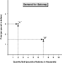
For example, the following chart relates the quantity of baloney sold to the price of baloney at a (fictitious) supermarket chain. The manager of the chain has only four pieces of data: When the price of baloney is $3, they sell 2,000 pounds per month, and when the price is $1.50, they sell 7,000 pounds per month.
You plot a point on this chart by going along the vertical (price) axis to find the $3 mark and along the horizontal (quantity) axis to find the 2,000 pound mark. Those are your coordinates for the first point to be plotted, which I've labeled point “A.” You do the same for the next two pieces of data, the price of $1.50 and the quantity of 7,000 pounds. Those coordinates yield point “B.”
Notice that charts should be properly labeled, as this one is. The title of the chart, “Demand for Baloney,” is clear, and each axis is labeled for the data that it represents. Also, the measure—whether it is dollars or pounds of baloney—is mentioned in parentheses. To understand a chart, you must have this information.
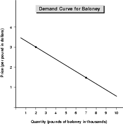
Now the two points on a chart can be connected, like in Figure 3.2.
When we connect two or more data points, the result is a curve. Figure 3.2 relates the price of baloney to the quantity sold—it tells us about the demand for baloney at these prices. Even if they are not actually curved, they are called curves. Some of the curves would normally be drawn as actual curves, but I have generally used straight lines to keep the data simple and the explanations clear.
Economists also call a curve like this—in which two variables are related—a function. That's because the quantity of baloney sold—the demand for baloney—is a function of its price. The two variables in the function are price and quantity. Of course, other variables may affect the demand for baloney, such as the time of year or the price of ham. But those are left out of this function so that the economist can isolate the relationship between price and quantity.
EconoTalk
A function is a curve or a mathematical formula (usually both) that expresses the relationship between two facts, which are known as variables. In a function, the variables are usually numbers. Of course, the political climate or a war could be a variable as well, but to find its way into a function, it would have to be expressed as a number, which economists can do.
The relationship between two related variables may be positive or inverse. In a positive relationship, as one variable increases, the other increases, and as one decreases, the other decreases. In an inverse relationship, when one variable increases the other decreases, and when one decreases, the other increases.
A scatter diagram shows the various data points plotted onto a chart. If the variables are related, the plotted points on a chart will tend to cluster into a pattern. The line of best fit is a line plotted through a scatter diagram that represents the relationship between the two variables.
Incidentally, the relationship between the price of baloney and the demand for it is inverse. That means that the higher the price, the lower the quantity sold, and the lower the price, the higher the quantity sold. Variables can also be in a positive relationship, meaning that as one variable increases, the other increases, and as one decreases, the other decreases.
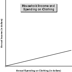
Figure 3.3, “Household Income and Spending on Clothing” depicts a positive relationship between two variables.
This chart needs no numbers to illustrate the positive relationship between income and spending on clothing: the higher the income the higher the amount spent on clothing, the lower the income, the lower the amount spent on clothing.
Two more points about charts are important.
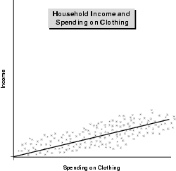
First, when economists, managers, or analysts plot data points on a chart, those points don't line up so that you can connect the dots and have a nice smooth curve in the way I do here. For instance consider the following set of data points, which, again, relate spending on clothing to annual household income.
The points all over the lower part of this chart resemble the kind of pattern that often results when the data on two related variables are plotted on a chart. This is called a scatter diagram, for the obvious reason that the data points are scattered over the chart. Data points that represent variables that are related will cluster into a pattern, but they certainly won't fall neatly into a line or curve.
Then what's that curve doing in there?
That curve is called the line of best fit. This is a line that is plotted through a set of data so that the relationship between the two variables becomes clearer. The line of best fit is calculated mathematically by computer in such a way that the distances between all of the variables and the line is minimized. In other words, the line of best fit is the line that is as close as possible to all of the data points. (That's why it's called the line of best fit—it's the line that best fits into the pattern of the data points on the chart.)
Again we will be dealing with simple curves. However, I want you to know that in reality, the data, the curves, and the functions are not always that simple.
Finally, what happens in situations where there is no relationship between two variables?
Suppose you were to plot average annual temperature in the United States over the past 50 years against each year's growth in real GDP. You might wind up with a chart that looked very much like the one in Figure 3.5.
Here there is no relationship between the variables, and no meaningful line of best fit or function to be developed. There is no discernable pattern to help us relate GDP growth to average temperature.
GDP growth and average temperature might, however, be related variables when considering the GDP of a single state. (Yes, each state has its own GDP.) For instance, unusually warm years might hurt the GDP of a state such as Vermont or Idaho, where ski -resorts bring in significant sums of money from other states.

Charting GDP
In addition to helping us clarify relationships between variables, charts give us a way to visually depict trends over time by relating a value on one axis, usually the vertical, to a point in time, usually on the horizontal axis.
For example, let's return to the nominal and real GDP data we examined earlier and look at the trend in GDP over that 12-year period. Trends are best seen in line charts, which plot the values of a variable over time.
Figure 3.6 is a line chart of the values for nominal and real GDP from Table 3.1. The solid line represents nominal GDP, and the dotted line represents real GDP.
EconoTip
It is up to the economist, analyst, or manager reviewing the data to think through relationships and their meaning when considering various data. No computer—or any other tool—can do that for us.
The chart is saying that annual GDP grew significantly in both nominal and real terms. The chart shows that nominal GDP grew faster than real GDP because the solid (nominal GDP) line is steeper than the dotted (real GDP) line.
Line charts are widely used in the investment profession to track the performance of various stocks. In finance, they are used to track sales, expenses, and other numbers. In economics, they are used mainly to see the trend of a variable such as GDP, income, and specific types of spending and production over time.
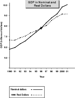
Also with a line chart and its underlying mathematical function, economists try to forecast the future performance of GDP, income, spending, production, and other variables. The mathematical functions—called equations—that represent the line are quite complex. But essentially, in economic forecasting and econometrics, which I mentioned in Overview of Economics, an economist plots a line that represents the relationship among multiple variables and attempts to gauge the future path of that line, and thus the future value of whatever is being forecasted.
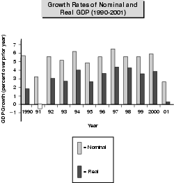
A bar chart is another tool that helps us make comparisons between variables over time. For example, again, going back to Table 3.1, the bar chart in Figure 3.7 shows both the growth rates for both real and nominal GDP from 1990 to 2001.
The chart clearly shows that real GDP growth was substantially less than nominal growth, especially in the years 1990, 1991, and 2001, when real growth was less than half of nominal growth.
In economics and in business, tables and charts are the two main tools for organizing, presenting, and analyzing data.
Excerpted from The Complete Idiot's Guide to Economics © 2003 by Tom Gorman. All rights reserved including the right of reproduction in whole or in part in any form. Used by arrangement with Alpha Books, a member of Penguin Group (USA) Inc.
To order this book direct from the publisher, visit the Penguin USA website or call 1-800-253-6476. You can also purchase this book at Amazon.com and Barnes & Noble.
Trending
Here are the facts and trivia that people are buzzing about.